Set size: 12 cards for the yellow set, 11 for the green
Front Design: Both sets are identical - a color photo is framed by a small black and white lined border, with the A's logo in the lower-left corner and McGwire's name and the card's title along the bottom border. The cards have either a green or yellow border, depending on the set. "Star '88" appears in the upper-right corner.
Back Design: The backs are identical and all printed in a green ink, repeating McGwire's name, the card title, and the A's logo at the top. The majority of the card is devoted to statistics, one season's highlights, career highlights, or other information about McGwire. These two sets are identified by the 1984 copyright date (despite the Star '88 notation on the front).
Parallels and Similars: All 1988 Star sets follow the same design, and there are two more sets issued that year with Mark McGwire.
Distribution: Cards were distributed by Star through dealers as complete sets. It is very rare to find a set broken up, especially given that most sets feature only one player.
Thoughts: While none of the cards would win an award for best photo, trying to fill forty cards with different photos of the same player means some of the photos are rarely seen on cards. Well, back in the 1980s, I suppose Fleer was really good about getting photos of players in the dugout, but these days images like the two above don't show up often on cards. Given the amount of recycling Topps does with photos, you would think some more (interesting/fun) dugout and non-action shots would make it onto cards. If you'd like to see more of this set, head over to my main blog, where a post hit earlier today with more photos from the set.
Additional Images:
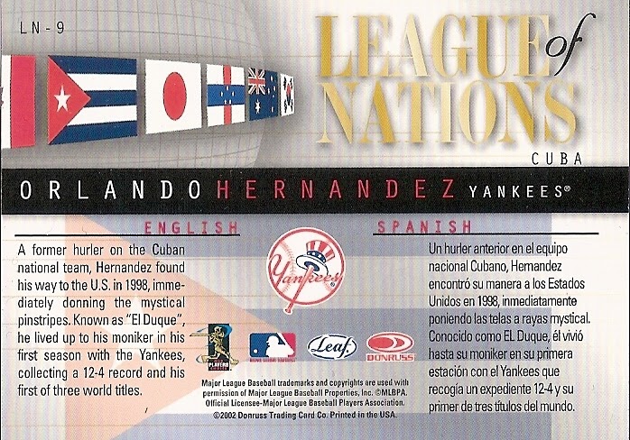
card backs